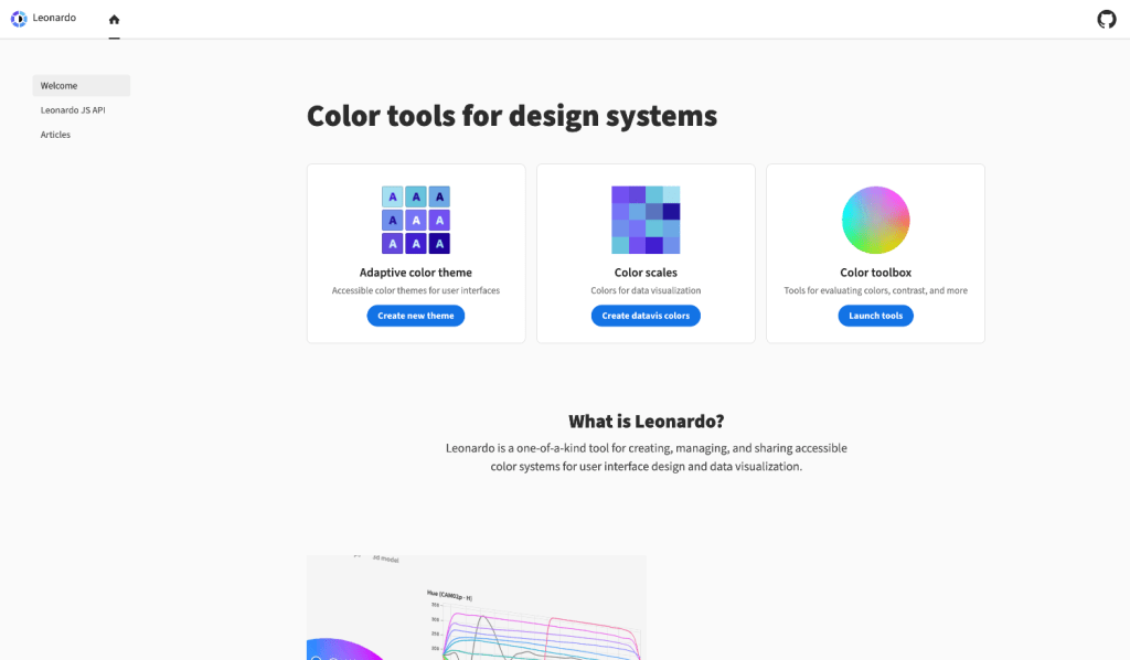
Leonardo (leonardocolor.io) is a unique tool designed for creating, managing, and sharing accessible color systems tailored for user interface design and data visualization. It features in-depth color analysis, charts, and 3D models, offering unprecedented ways to evaluate color themes.
The tool provides precise color control, facilitating the development of color scales and palettes that meet accessibility standards and enhance the visual experience of digital products
Leonardo (leonardocolor.io) is a comprehensive tool for creating adaptive color palettes, primarily aimed at enhancing the accessibility and aesthetics of user interfaces. Some of its key features include:
- Diverse Color Space Support: Leonardo allows interpolation of colors across various color spaces like LCH, LAB, HSL, HSLuv, HSV, RGB, and CIECAM02. This feature provides flexibility in creating color scales that best fit the design requirements.
- Contrast-Based Color Generation: One of the primary functions of Leonardo is to generate colors based on target contrast ratios. This is particularly useful for adhering to accessibility standards like the WCAG 2.0.
- Dynamic Accessibility: The tool caters to dynamic accessibility needs by enabling the creation of color palettes that can be adjusted for brightness and contrast, meeting the needs of a wide range of users with varying visual capabilities.
- Color Scale Interpolation and Key Colors: Users can input key colors to generate a color lightness scale. The tool automatically sorts these colors based on their lightness in the chosen color space, ensuring a uniform distribution of color lightness.
- Contrast Ratio Swatches: Leonardo provides the ability to define specific contrast ratios for colors. It generates color swatches based on these ratios, allowing designers to visually assess and meet contrast requirements.
- Visualization Tools: The app includes charts and a 3D model to visualize color scales and their interpolation paths in different color spaces. This helps in identifying the best color space and any needed adjustments.
- Integration with Design and Engineering Workflows: Leonardo's configurations can be easily shared through URLs, facilitating collaboration between designers and engineers. It also provides a JavaScript module for integrating the generated color palettes into products.
- Adapting Existing Palettes: The tool allows for the easy adaptation of existing color palettes into contrast-ratio-based ones, making it simpler to transition to more accessible color schemes without abandoning current designs.
These features make Leonardo a powerful tool for both designers and engineers, focusing on creating accessible, aesthetically pleasing, and adaptable user interfaces and digital products.
Key insights
- 🖌️ The ability to adjust saturation and hue in the color scale allows for fine-tuning and customization, ensuring the theme meets the specific needs and preferences of the user.
- 📊 The inputs for contrast ratio and lightness value are synchronized and show a pass or fail status as you edit them, ensuring accessibility compliance.
- 📊 The lightness tab in Leonardo provides a preview of the monochromatic version of colors and charts for contrast and lightness, offering different ways of visualizing rates of change.
- 🎨 The evaluation of color properties in Leonardo's accessible themes allows for the creation of palettes with complementary, split complementary, triadic, and analogous color harmonies.
- 🎨 The ability to choose different color spaces in Leonardo allows for a more comprehensive evaluation of themes and their balance.
- 🖌️ The feature to modify lightness, contrast, and saturation of colors in a theme provides flexibility in creating visually appealing and accessible designs for different environments.
- 🖌️ The ability to generate an svg ui kit from the theme makes it convenient to integrate the design elements into various design tools like Adobe XD and Figma.
- 📊 The contrast ratios provided for each color allow for specific usage recommendations, ensuring accessibility for both large and small text.